


When it comes to running a successful business, first impressions matter. The colors you choose for your commercial space can have a significant impact on how customers perceive your brand and how they feel while inside your establishment. Whether you own a retail store, restaurant, office, or hotel in Los Angeles, selecting the right paint colors can enhance your business’s appeal and even drive sales.
At Richard Stewart Painting, we know that the right color scheme can make all the difference. Let’s explore some of the best commercial paint colors that can help attract customers and keep them engaged.
1. Blue – The Color of Trust & Stability
Ideal for: Offices, Banks, Healthcare Facilities, Corporate Spaces
Blue is a color associated with professionalism, reliability, and calmness. It’s commonly used in office spaces and financial institutions because it promotes focus and trust. Lighter shades of blue can create a soothing atmosphere, while darker blues add a sophisticated, corporate feel.
Best Uses: Reception areas, meeting rooms, financial institutions, law firms.
2. Red – Bold, Energetic, & Attention-Grabbing
Ideal for: Restaurants, Retail Stores, Gyms
Red is one of the most dynamic colors you can use in a commercial setting. It stimulates appetite, making it a popular choice for restaurants. It also evokes a sense of urgency, which is why retailers use it for clearance sales and promotions. However, red should be used carefully—too much can feel overwhelming.
Best Uses: Restaurant interiors, fitness centers, promotional signage, accent walls in retail stores.
3. Green – Refreshing & Natural
Ideal for: Wellness Centers, Organic Stores, Cafés
Green is a color that represents health, balance, and nature. Businesses that focus on sustainability, wellness, or organic products often use green to reinforce their brand message. Soft, earthy greens work well in relaxing spaces, while brighter greens create a lively and energetic feel.
Best Uses: Health food stores, yoga studios, spas, eco-friendly brands.
4. Yellow – Cheerful & Inviting
Ideal for: Restaurants, Childcare Centers, Creative Spaces
Yellow is known for its uplifting and friendly vibe. It’s a great choice for businesses that want to create a welcoming and positive environment. However, too much bright yellow can be overwhelming, so it’s best used in moderation or paired with neutral colors.
Best Uses: Play areas, cafés, brainstorming rooms, casual dining spots.
5. Black – Sophisticated & Luxurious
Ideal for: High-End Boutiques, Luxury Hotels, Upscale Restaurants
Black is associated with luxury, power, and exclusivity. It’s a favorite among high-end brands that want to create a sleek and elegant look. While an all-black space can feel heavy, combining it with metallic accents or contrasting neutrals can create a bold and modern aesthetic.
Best Uses: High-end retail stores, luxury restaurants, hotel lobbies, modern offices.
6. White – Clean, Minimalist, & Professional
Ideal for: Medical Offices, Salons, Art Galleries
White represents cleanliness, simplicity, and professionalism. It’s an excellent choice for medical offices and spas, as it creates a fresh and sterile environment. However, using an off-white or warm-toned white can make a space feel more inviting rather than cold and clinical.
Best Uses: Doctor’s offices, beauty salons, modern retail spaces, art galleries.
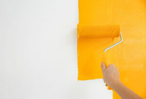
7. Orange – Fun, Energetic, & Engaging
Ideal for: Gyms, Entertainment Centers, Fast-Casual Restaurants
Orange combines the excitement of red with the warmth of yellow, making it a color that radiates enthusiasm and creativity. It works well in spaces where businesses want to create an energetic and social atmosphere.
Best Uses: Fitness studios, fast-food restaurants, game centers, team collaboration areas.
8. Gray – Versatile, Modern, & Professional
Ideal for: Offices, Hotels, Showrooms
Gray is a neutral color that offers flexibility and modern appeal. It can create a sleek and polished look while allowing other elements in a space—such as artwork, furniture, or lighting—to stand out. Lighter shades of gray are great for a soft, professional look, while darker grays can add depth and sophistication.
Best Uses: Business offices, lobbies, hotels, tech companies.
Choosing the Right Color for Your Business
Selecting the right color scheme isn’t just about aesthetics—it’s about creating the right customer experience. Whether you want a space that feels energetic and exciting or calm and inviting, the right paint color can set the tone.
At Richard Stewart Painting, we have over 30 years of experience in helping businesses in Los Angeles find the perfect paint colors to enhance their brand and attract customers.
Looking to refresh your commercial space? Contact Richard Stewart Painting today at 1.818.951.1181for a professional consultation and expert painting services!
Recent Comments